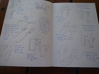
For my initial Idea's I researched different letterforms, different ways to represents the word 'Layer' and different letters. I experimented with different type, and different fonts, and this allowed me to decide what worked best and what didn't work quite as well. During my experiment stages I also decided that I would use a range of both uppercase and lowercase (this then became one of the main basis themes for my brief). I went on to use the uppercase and lowercase letterform of each font to create this layered contrast which looks really effective.
Here is some initial research;
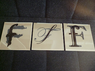
I used acetate and black marker pen to create my final hand drawn outcomes which look really effective when presented on card and layered to give the effect of 'transparencies within type'. The harsh colouring and simple tone of plain black looks really effective and exaggerates the type to the audience making it stand out as the focal point of the design. As a set or series, the 10 final outcomes work really well and I have used an 'off-white' card for the background as this gave the designs a more professional appearance, whereas using white card gave a yellow-tone to the acetate with a very 'cheap' appearance. Below I have photographed both versions on off-white and on white card to show the contrast between the two.
I initially chose the letter 'F' as this had a similar format in both lowercase and uppercase and would work well together when layer, unlike letters like 'A' which have a very different appearance in uppercase and lowercase.


