Taking our earlier images (mine of which were based on the word three) we had to choose our favourite 5 images; Here are my selection...


We then had to take one word.. based on our four images.
My chosen word is....
REPEAT PATTERN
Taking our earlier images (mine of which were based on the word three) we had to choose our favourite 5 images; Here are my selection...
In today's session of OUGD404 Design Principles we were each given different key words and then had 2 hours to walk around campus and find images that related to our word. My word was 'three', and so here are my favourite images from the session. I collected around 60 images in total but here are a select few;


For Task 4 we each had to collect 3x magazines, 3x newspapers and 3x posters before analysis the type and creating different hierarchies for each. I chose 'Company' as my first magazine which is a well known fashion mag. Here are some images from pages that I found visually interesting;


What skills have you developed through this module and how effectively do you think you have applied them?
I feel that I have developed my confidence skills, whilst I've never been one to refuse to stand up and talk in front of large groups, I've also never really been the person who volunteers or enjoys it either, and I feel that the past 8 weeks or so have allowed me to expand my confidence with talking to new people and standing up in front of different groups and talking about my work, my concept and why I went about it the way I did.
I also feel that thanks to the short briefs I have developed a greater ability to develop idea's within a short period of time. Coming from A-level meant I had two projects over the full academic year and therefore to have so many in such a short period of time came as a new learning curve.
I have managed to broaden my knowledge of Adobe Illustrator during the workshops with Simon. Despite using illustrator over the past two years on my previous course, I learnt many new skills and developed area's where I already had a basic understanding of how to work the programme. I then applied these skills to my Proverbally yours set of briefs which allowed me to expand and develop my work with the pen tool.
I think I am still in the process of developing my ability to work effectively to a brief. Whilst this has come a long way since beginning the course here back in September I still feel that I am on a long learning path and that over the coming months and years this skills set will be refined and developed further.
I can now confidently critique, analyse and evaluate both my own work as well as other people's giving my honest opinion and offering constructive criticism where necessary. As well as critiquing both my own work and work of peers the sessions with Jo have allowed me to develop my vocabulary when discussing work of other designers, this has also allowed me to develop specific skills key to Graphic Design.
I have also been a very neat and organised person and so I knew I wouldn't have much need to develop my skills there, however I feel that I have strongly developed my understanding of a more 'professional' Graphic Design atmosphere, working on many different projects at the same time by managing both OUGD403 along with other module like OUGD401 and OUGD404 etc. This has been vital to my time management and organisation skills.
I think that I have more recently managed to grasp blogging, whilst I'e had a personal blog for the past 6-7 months or so I feel that the intense nature blogging has on this course has finally sunk in, and in the later two briefs I have managed to blog various stages of the processes I have been on allowing my blog to tell more of a story. I hope to continue to expand these skills over the coming briefs and modules and develop a very organised and focused approach to blogging.
What approaches to/methods of idea generation have you developed and how have they informed your design development process?
Being a perfectionist I have always found it difficult to include rough design sheets in my working process. However being involved in the workshops with Amber has allowed me to develop my understanding of design sheets and also allowed me to realise the importance of jotting down quick idea's in a short period of time. I have found this difficult at times however I feel that my process with design sheets is constantly developing and I am becoming more and more confident as I complete more briefs throughout the programme.
Blogging is a key part of my design development. It allows me to think out loud (or on screen) and gives me the opportunity to think through idea's slowly which I have found often develops my working process sparking new inspirations and development ideas. I feel that blogging research also allows me to expand my design idea's, over the OUGD403 module I didn't really fully get into research blogging until the final brief, however throughout this brief it led me to many different new idea's and I now hope to blog more and more research as my briefs develop over the rest of this academic year.
I have also developed my understand of the importance of the library. I now find many of my inspirations in books and journals and find it easier to gain enthusiasm for a design when I can visual see a piece in front of me. I have taken full advantage of the photocopying system and now use this to regenerate idea's from inspirations in books and journals.
The progress crits have been a strong part of my idea's generation. When I am stuck on where to go next it is really positive to gain feedback from other on their opinion and also to understand whether my work is going in to right direction to meet the criteria of the brief, as well as whether is it understood from the view of someone else.
As well as the progress crits, me and my peers often guide one another of different paths to take etc when working in studio. I have never really liked the studio environment in college, however, since being here I have begun to realise it's importance in gaining inspiration and advice from others, and have often ended up staying late without realising as I get carried away working on a brief.
What strengths can you identify in your work and how have/will you capitalise on these?
I feel one of my greatest strengths since coming here is my ability to stand in front of a group of people and talk confidently about my work. This is something I have never before had the confidence to do, however I now realise that is a vital part of developing my design processes.
Another key strength is time management and organisation. I have always been prompt with briefs and deadlines and never needed extensions. I think this is a really important habit to get into as this will be expected in industry and often the time scales will be much more restricted than ones I've had to deal with so far.
Punctuality and attendance has to be one of my strongest assets since becoming a student at Leeds College of Art. To date I have never missed a session leaving me with 100% attendance and 100% punctuality as I have also never been late. I think this is really important as it gives a more professional view for employers. I also have a fear of taking time off as I hate the feeling of knowing you have to catch up on all the work you have missed whilst being away. As this is a high demanding course there are things happening everyday and so I feel it is vital to attend every session in order to make the most of my time here.
I feel that one of my strongest briefs so far has to be the partner typeface. Despite really struggling for inspiration and ending up using an idea that I didn't feel related to Sam's personality I am really pleased with the aesthetics and visual appearance of the final outcome. If I had even more time I would possible alter one or two of the letterforms however I feel visually they are strong and also work as a typeface which I developed at a later stage using the phrase 'the quick brown fox jumps over the lazy dog' to demonstrates that my typeface works when used to create words as well as being both readable and legible. I also feel that as the briefs have gone on they have got stronger and stronger, my understand of the working process and need for design sheets and research have strengthened and this has strengthened by designs as an overall piece too.
What weaknesses can you identify in your work and how will you address these in the future?
One of my greatest weaknesses is my perfectionism. I understand that whilst this trait also often falls under the category 'strengths' it often can get in the way of my designing process. I struggle to come up with rough idea's and design sheets, as I find them harsh to look at, however over the past few weeks this has come a long way and I hope that in coming briefs I will be able to create lots of design sheets showing my full working process in how I came about a final solution.
A great weakness is my ability to produce idea's quickly in a short period of time. I have been working on this in the sessions with Amber and over coming briefs hope to further this even more allowing myself to show every thought process without worrying about the way it looks or comes across on a design sheet. I tend to start worrying about producing idea's fast which stops be from jotting them down and then I lose the initial idea's that I wanted to go with.
I feel that my Illustrator brief is one of my weakest designs as I don't feel is shows many skill sets. However I chose to go with this idea as it was the one which was most aesthetically pleasing and visually attractive. It stood out which was also what I wanted to brief to carry across and as is demonstrated on my blog I found it difficult to take my idea's from Brief one, as inspiration for this design. I came up with many visual solutions before deciding that this simple example would be the one that had most impact and carried most effect.
Another area I would like to improve is putting my own personal style into all my designs. I feel they are very jumbled and don't tell a lot about my Personality, I hope to improve this over the coming Modules and Briefs. I hope to challenge myself more and create more interesting pieces.
Finally I would like to expand my understanding of design processes. I am very looking forward to different inductions and things coming up as I will be learning new skills that I can hopefully use and portray within my working style on set briefs.
Identify five things that you will do differently next time and what do you expect to gain from doing these?
- Produce a greater number of design sheets at a high standard. This is my main focus over the coming weeks and months. It's an area i've always though of as weak within my working process and hope that I can develop and expand this for future designs and briefs.
- I hope to further my research skills, and remember to blog every stage of my process. I often take research for granted not always realising everything I do that is counted as research towards a brief.
- Take on board more advice from the crit sessions, especially progress crits. I feel I have successfully tried to take on board advice in crits changing aspects of my 'proverbally yours' poster set, as well as altering the mailing list from my final brief as a result of crit feedback, however I hope to take more advice on board in future even if I don't always initially agree with their opinion, I might find the visual outcome stronger.
- I hope to be more experimental with new processes including print methods etc. After all of my inductions are over I hope to use the skills learnt in these sessions throughout my briefs to expand the style of work being produced.
- Finally, I would like to create more structure to the briefs, and tell a story through my design sheets and blog posts which allows people to understand the journey I have been on to create that piece as my final outcome.
How would you grade yourself on the following areas?


Yesterday we had our final critique session's for our 'Proverbally Yours' Part 2 brief. We were each put into pairs and had to define 5 crit questions that would be the basis of our analysis of other peoples work. I was paired with Andrea and we critiqued to other peoples work whilst other people critiqued my own work. Overall I gained very positive crit feedback, one group made me aware of spelling mistake on my mailing list, which is only a minor detail easily altered, whilst another group suggested that I had made the best of a link between my proverb 'out of sight, out of mind' and my 'fisherman' profession, however the create a better link between the two I could incorporate a deep blue tone into my original 3 poster designs. With the feedback from my earlier poster crit to change the composition make the series of images create a whole face I have now redesigned my original posters taking on advice from two different critique sessions. Overall I am pleased with the outcome of both Proverbally Yours briefs. However, as further development for my 'fisherman' I will create a 'belly band' to prevent any flyers being lost in the post ( another factor suggested by one of the crit groups). Overall I gained positive feedback from all who critiqed my work.
Here are copies of the critique sheets filled out with reflection of my work;


For our final crit session this coming Friday we have been split down into our DP1 groups, and then paired into alphabetical order. My partner is Andrea and me and Andrea will be assessing two other peoples work by a set criteria. We had to devise this criteria today and stick to it. We have five initial criteria by which we will critique the work on Friday;
- does the design have a strong aesthetic impact?
- does the use of the proverb work effective and relate to the piece?
- is the target audience appropriate to the brief?
- does the resolution fit with the concept? (final outcome)
- how had the idea's development affected the final outcome?
(is the research relevant, is there a strong link to the original poster, is there a wide range of development, etc)
Issues Raised
- what is the purpose of the design?
- who are the audience, how is the piece directly targeted at them?
- the idea works well and indirectly relates to the original proverb 'out of sight, out of mind'
- where does the proverb appear on the design?
- is it right to incorporate a different proverb to represent 'out of sight, out of mind' indirectly?
Actions to be taken
- focus more heavily on the purpose of the piece (to create a campaign awareness for 'project ocean'
- think about the audience, and create a stronger focus or target (who are they, how is it aimed at them)
- incorporate my original proverb effectively
- create my typeface using Adobe Illustrator
- book my print appointment in the principle dungeon
- address the problem of stock (what weight of paper will i use, what texture, and will i use card?)
- construct mailing list which is visually and aesthetically pleasing.
Structural order of importance
- create typeface using Adobe Illustrator for design
- focus more heavily on a solid purpose
- think about audience and how they relate to the purpose of the piece
- incorporate my original proverb; 'out of sight, out of mind'
- construct a visually appealing mailing list
- address stock issues; will it print easily, can you print double sided etc.
- book digital print appointment
For this crit session we each analysed two people's work anonymously and our work was also analysed anonymously by two individuals with no verbal feedback or discussion taking place, the feedback was provided in a written format. The feedback came in the form of a series of answered questions about my work. After receiving two feedback sheets, this allowed me to gain two differing perspectives and two different opinions of my work, some points made were similar whilst other's differed largely in advice and criticism. The main concurrence about my work was that it worked really well and the fact it was anonymous meant I gained more honest feedback which was more supportive. I gained some interesting comments, many about the use of black and white and how they felt colour would have worked better. However I did earlier experiments with colour and from peer feedback at the time I decided to go with a more neutral appearance. Other feedback which came back was that I could experiment with the visibility of the text so show that this is also out of sight, or make it 'double vision' as though she is closing her eyes and seeing double. The most interesting feedback I gained was to experiment with mirroring the features on the 'image' piece and the 'type and image' piece, so that the series would make a complete face. This is really interesting and certainly something to work with. Here are my crit feedback from my 'Proverbally Yours' brief (21/10/11);


This brief involved designing a typeface for another persons character and personality, we could ask the person a set series of questions and then had to work from the results of the questionnaire as inspiration for our designs. For the crit session 5 or 6 groups of pairs were taken into studio 4, where we placed all our work onto the wall and analysed each piece individually. As pairs, each person was asked to discussed what they thought about the typeface designed for them and what was saying about there personality, as well as whether they thought it related to them. This then lead to group discussion about how successful the work had been.
I felt the typeface that had been designed for me was closely related to my personality as it was based around walking and as I have recently completed a 100 mile hike over 6 days this certainly related directly to my personality. I really liked the simplicity and the use of lowercase type however that would not I been my personal choice I still feel it works well as a final piece. The typeface that I designed for Samuel Hoh was based around dinosaurs and although I don't feel that it related to Sam's personality I do feel it worked successfully as a series and as a final outcome. Sam's feedback about my design was that it didn't relate directly to him, however he liked how I had related the typeface to a similar structure of that of 'kai' (one of Sam's favourite typefaces). He did like how the letterforms worked as a series and he said he was pleased with the piece. He also liked how the entire piece was completely hand drawn whereas the majority of people used Adobe Photoshop and Adobe Illustrator to help construct their designs. However, because the final outcome was to be hand rendered I chose to hand render the entire piece form beginning to end and this was really well received in the crit session. I feel the reason I struggled to come up with initial idea's for the brief was the little information provided in the questionnaire, however after speaking with Amber about this I jut went with what I had there on the sheet. Overall, my piece was given positive feedback and I now need to expand on this work by producing some words using the letterforms.

For this specific crit session the entire year groups work was placed into groups of the same word, for example all of the typefaces that represented the word 'layer' were placed together. With everyone from our group we then critiqued another groups work anonymously. As pairs within the groups we first discussed the work generally before selecting a serious of 5 criteria by which we would analyse the whole series of work as a large group again. We then looked at the body of letterforms created and viewed them as individual letterforms and not sets or series' which was what the initial brief required. By a process of elimination we began to remove any work that did not fulfil our criteria (for example; legibility, composition etc) until the group of letterforms was narrowed down to 5 final letterforms.
The work that I created in response to this brief worked as a series. My worked represented the word 'layers' and I tried to take a more unique approach. I got really good feedback from the crit as people liked how I had 'literally' layered uppercase and lowercase fonts on top of one another to create a new typeface. Although they worked as a series in the sense that I did the same technique to all of the letters, they were individual in the sense that each typeface of uppercase and lowercase, to create the new letterform was a different font. I feel this worked well however crit feedback allowed me to realise that others felt the whole 10 final letterforms should have originated from one basic original typeface. Overall I got really positive feedback from the crit and two of my letters made it into the final 5 for the word 'layer'. I learnt from the crit session that although you make look at your own work one way and completely understand how it relates to the initial brief others may interpret it differently and feel it doesn't relate as directly. Finally, my work was deemed successful as a series and as individual pieces by the assessment team who were analysing my letterforms.
During reading week, we each had individual progress tutorials with Amber to assess how we are getting on and our current progress so far. Here is a list of things I hope to complete or improve over the next couple of weeks on the course;
- maintain 100% attendance
- develop briefs further (create words out of 'alphabet soup typeface' brief)
- keep blog up to date at all times, and remember to make detailed comments about briefs.
- blog lecture notes with accompanying images
- link design practice blog more heavily to design context blog
I have finally managed to digitalise all of my typeface based on Sam's personality. I really like the outcome and have produced in both a high contrast black and white copy as well as a more vibrant black and orange version also. I think it looks really effective and although not as precise as my original hand drawn version I feel that it is clear and works well as a typeface being both easily legible and readable.


Here are my latest poster designs photographed in context. The outcome is really striking and shows how they would appear to people passing by and how their simplistic approach draws attention.


Here I have taken my lettering from my Alphabet soup Adobe Illustrator brief and created the phrase 'the quick brown fox jumps over the lazy dog'. This incorporates all letters of the alphabet and therefore allows me to see if my type works and is both legible and readable. Here are the images;


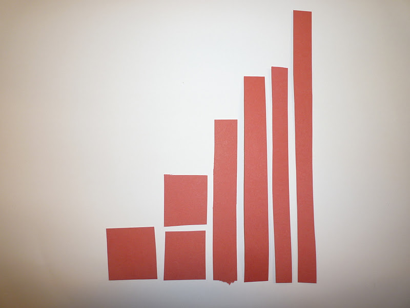
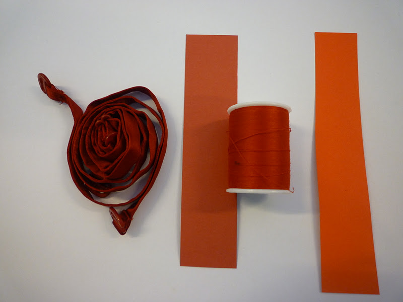
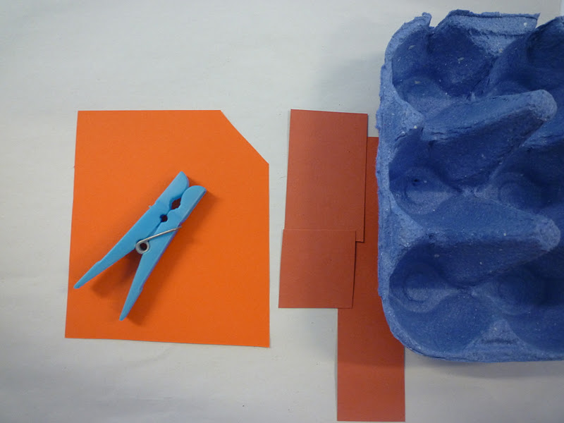
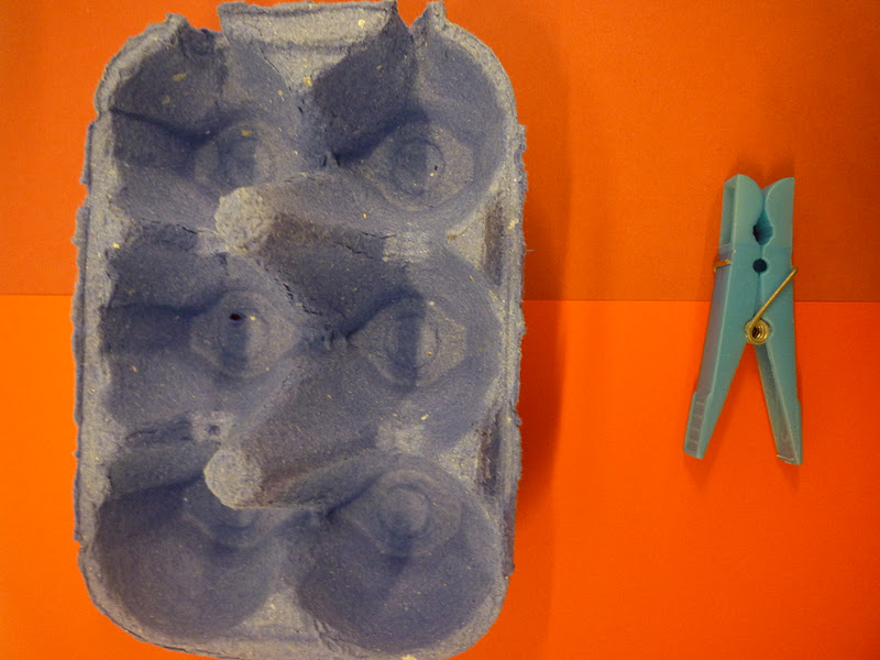
In today's Design Principles session we furthered our knowledge of Colour Theory. Amber led the session and we looked at layering different colour paper's and experimenting with how different shades of one colour give different effected when placed on the same surfaces. Here are some experimental images from the session. My base colour was 'dull' red, and I think introduced a more vibrant red before finally looking at red's complimentary blue in two different tones.