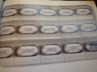
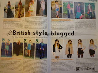
For Task 4 we each had to collect 3x magazines, 3x newspapers and 3x posters before analysis the type and creating different hierarchies for each. I chose 'Company' as my first magazine which is a well known fashion mag. Here are some images from pages that I found visually interesting;
The first page spread above from 'Company' design magazine looks nice and colourful with legible type, however I feel that the imagery can make the page as a whole seem confused of busy. The page spread on the right hand side from the same magazine contains an advertisement, however I find this really un-aesthetically pleasing. It has a very 'cold' appearance, however I like how the type has been combined with the image to play with the mind of the audience, this is a really strong appearance. Below is a close up of the image showing how type has been included;
Below is the page I found most aesthetically strong from 'Company' magazine. I like the structured format and simplistic layout. Basic typefaces have been used which makes it easy to read and clearly legible. The bold title is also in the muddle of the page across he double page spread which is an unusual format that stands out really well.


