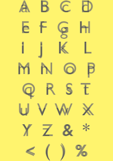
I decided to experiment further with layering lowercase on top of uppercase and using yellow as my dominant CMYK tone. Here are my experiments and solutions;
Above are final solutions one in black and white and one in yellow and white to show contrast. This works really well however I became concerned that it more closely resembled the word 'extract' and not my word 'layer'. Because of this I decided to take on a completely different direction and look at how I could represent the word 'layer' more effectively.
Below I have taken the colours yellow and black as these worked really effectively from my previous experiments. However I have decided to further my development of the word 'layer'. Below I have used 70% CMYK for the background and layered 50% black type 'Gill Sans' over the top in upper and lower case to create this strong contrast.
After peer feedback it came back that a stronger 100% CMYK yellow would look more dominant and more effective giving off a vibrant tone. I also decided to layer different character from the 'Gill sans' font family. Below I have use light, light italic, regular, regular italic, bold, and bold italic. Although this looks really effective and also relates to elements of OUGD404 'design principles' I felt that using the entire font family became quite distorted and confused and so I decided to refine my idea taking away the elements 'bold' and 'bold italic', the new refined version is shown below.
Below is the final version, which is very simple yet effective and also more legible now I extracted the 'bold' and 'bold italic'. The colours are really contrasting and compliment each other well.


