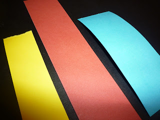
In today's Design Principles session we furthered our knowledge of Colour Theory. Amber led the session and we looked at layering different colour paper's and experimenting with how different shades of one colour give different effected when placed on the same surfaces. Here are some experimental images from the session. My base colour was 'dull' red, and I think introduced a more vibrant red before finally looking at red's complimentary blue in two different tones.
Design Principles // Colour Theory
Further experiments with the primary colours and how dominant they are.
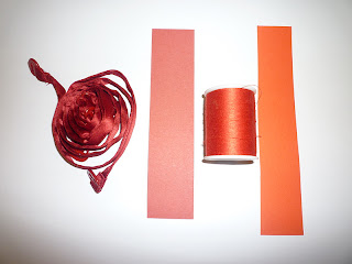
Experiments with colour and objects;
I found a 'dull' and 'bright' red object for each coloured paper I had.
We then used contrasting colours, and places blue objects onto red card.
After experimenting with objects we looks at typography and placed different shades of red card onto a plain background card.
We then looked at other shades of colours and how they contrast.
Wednesday, 16 November 2011
by Lisa Collier
Categories:
Colour Theory,
OUGD404
|
Leave a comment


