Today we have had a productive day decided on logo designs, and Greg has produced a series of solutions to how our website design would appear visually on an iMac screen as well as on an App for the iPad. From our design boards we had a few logo ideas of i took the ones we liked the best and then put them into illustrator.
We liked this one the best, but we had an initial concept that we would incorporate post it notes into our design, because the represent making notes on work, progress through work and making lists - something every designer does.
So then we decided that we would use a square shape instead of the circle.
We wanted to go with a clean sophisticated look.
I took inspiration from the designspiration website.
I then tweaked these to show the new logo using the square instead of the circle.
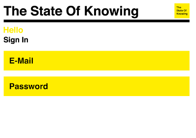
This is our final base layout, and if i were to build the site and host it properly this is what it would look like.
For time, cost and capability purposes we have created a tumblr site in which i have implemented as much of this design as possible. (This will follow in a future post)
Designs in Context
I have also re-tweaked the design to show how it would look if we expanded it into an iPad/iPhone based application to accompany the main site.


