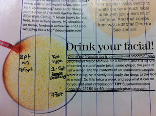
I decided to revisit the measuring type session that we did a couple of weeks ago with Lorenzo. I used this double page spread from the magazine as a basis for my re-designed double page spread. Here are some images from my re-work. I am slowly becoming more and more confident with measuring type and my use of grid layouts.
A traditional point is approximately 1/72 of an inch or .01384 inch. With the advent of desktop publishing, the point became exactly 1/72 of an inch. 12 points = 1 pica, and 6 picas = 1 inch.
This method of measuring is still used for digital type. Often, because some faces have very long ascenders and descenders, these typefaces look smaller than others when both are printed at the same point size.
Here I have looked at measuring type from the ascender to descender. I have also looked at line placement and spacing and worked out that (for example below) the text is 7pt on 9pt.
X-height, technically, is literally the height of a lowercase “X” in a typeface. It’s important to understand and recognize because X-Height can impact a typeface’s “visual weight” and readability and therefore impact on the typesize that we choose.
The size of a type can seem misleading. Because it is not what we usually think of when we look at type. Normally, we’d think that type size was all about the capital letters. But the actual measurement of type size is from the tip of the ascender to the bottom of a descender of a letter.


