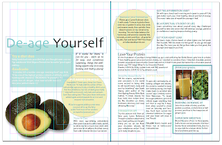
Here I have decided to go back and develop a new layout, as I still felt I could improve upon my earlier designs. I have taken inspiration from my previous design however and so visually it all appears very similar.
Here is my latest progress: I will be taking this in to the digital dungeon later to print.
I feel that this design flows much better and each element works together as a series rather then being very disjointed - this was something I found difficult to work with at first as the spread I had chosen to recreate was already very disjointed and I wanted to improve upon this.
Grid & Layout: Further Development
Friday, 20 April 2012
by Lisa Collier
Categories:
OUGD404,
Type and Grid
|
Leave a comment


