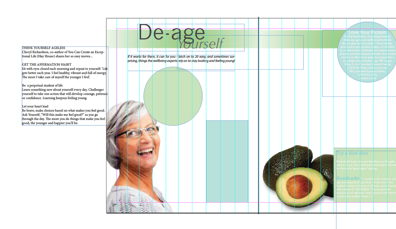
For lorenzo's task I have decided to recreate a spread that I found in magazine called woman&home. I felt that it has a lot to play with and I could be more creative with this.
Before the workshop we looked at working out the grids for our magazines (and initially, I did decided to use a different magazine layout - however I changed my mind as I felt I could be more experimental with the edition from 'Woman&Home'). In mine I found ti difficult at first to find a suitable grid layout as all the gutters and columns were un even. This resulted in quite a complex grid format with numerous columns.
I also experienced difficulty with negative leading for my initial double page spread I had chosen, I found this very confusing - however I did sit down and work through this with Lorenzo.
There was an average of approximately 7 words per line. We also worked out the point size of the text that we were using.
In our second workshop with Lorenzo, we started to look at deconstructing and reconstructing magazine layouts we felt weren't looking at their best.
Before the workshop we looked at working out the grids for our magazines (and initially, I did decided to use a different magazine layout - however I changed my mind as I felt I could be more experimental with the edition from 'Woman&Home'). In mine I found ti difficult at first to find a suitable grid layout as all the gutters and columns were un even. This resulted in quite a complex grid format with numerous columns.
I also experienced difficulty with negative leading for my initial double page spread I had chosen, I found this very confusing - however I did sit down and work through this with Lorenzo.
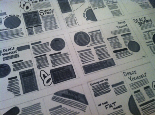
After drawing up the grids, we then started working on our layout designs.
Initially I really struggled with working on the Grid layout, however at the same time I found it really interesting as one aspect that I do miss form studying my a-levels is maths, and working with precise measurements and in some respects with this task I was in my element. The one thing that I really struggled with was getting the size of my body copy, images, and titles relative. However, in the enlarged version I created before making the design digital I became more confident and this was much more accurate.